Pixel Art: A journey in efficiency and a lack there of.
When we initially came up with REZ PLZ, we knew we wanted to use pixel art as our medium.It’s probably our favorite art style for a game, and it perfectly fit the nostalgic tone the game is going for. There was only one small catch, I’d never done pixel art before. Having worked as a freelance artist and as a model maker in the stop motion industry, my background was in design and sculpture, I hadn’t worked in single pixels since we had MS Paint on the family computer as a kid.
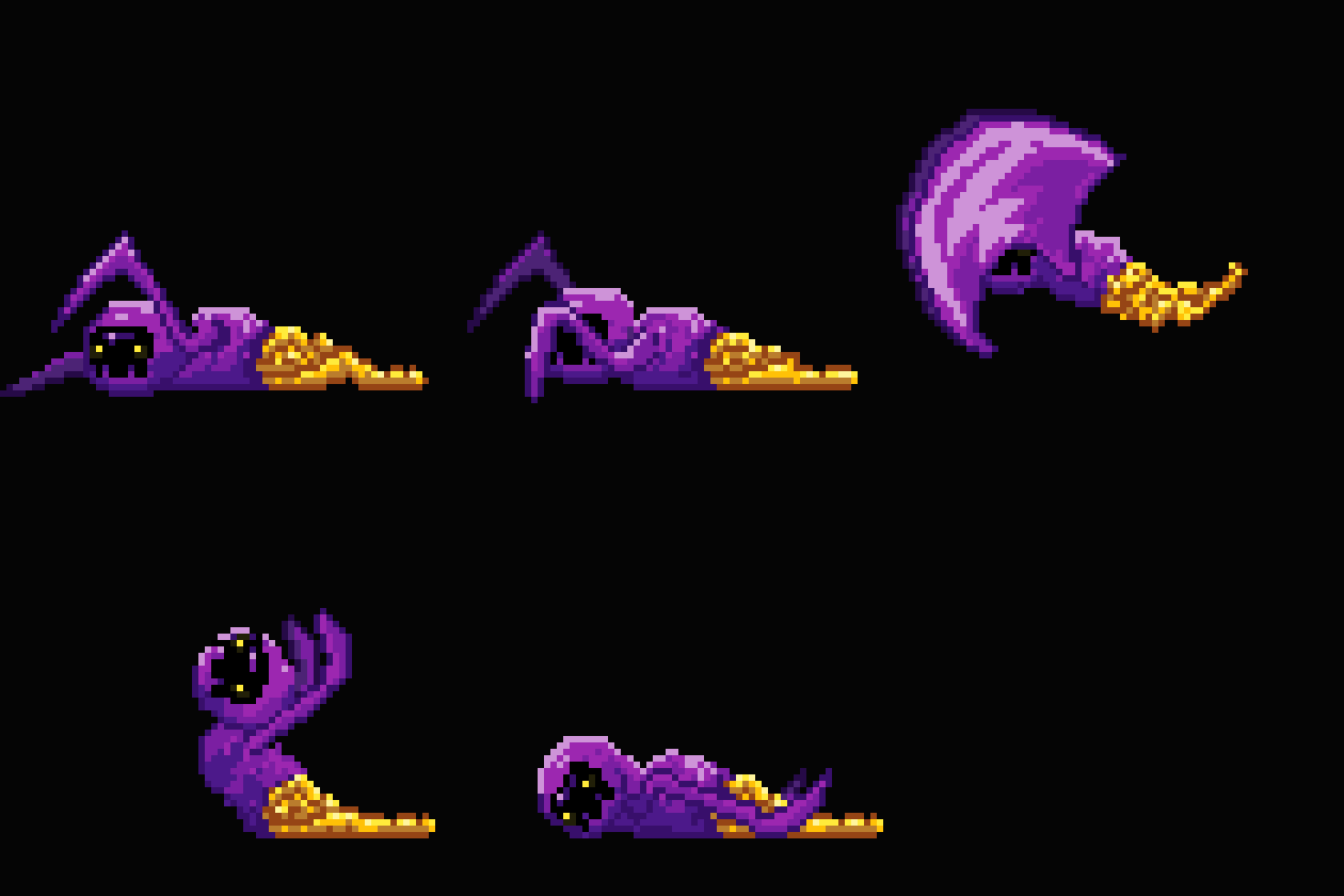
Where to begin? How to git gud as fast as possible? The answer has been and always will be: practice. I make no claim that I am by anymeans an expert, but I can safely say at this point, that I have spent a good chunk of time doing pixel art, and my stuff is passable albeit far from perfect. but to give you an idea of how far I’ve come, here’s some early stuff I did, and it’s final version:
The initial monster idea, was called the Dark Crawler.
four years later, the Unholy Diver is skewering the boys as hard as he possibly can.
Tools of the Trade
Software wise, I was experienced with Photoshop, but knew nothing about animating in it. After some flailing around in it a bit, I decided it’s really not the way to go for pixel art, and ended up picking up Aseprite.
This software has everything you need to do pixel art, and nothing that you don’t. I fiddled with a couple other options, but this one felt just so perfectly intuitive and user friendly for me. If I had to give it a rating, 10/10. It’s also still actively supported by the developer. At this point, I don’t know what to ask for that they haven’t already patched into it!
Ok, back to pixels. when we started, we wanted to do something low resolution, like 32x32, but I wasn’t very good at working with the restrictions, and after seeing insane stuff like Owlboy, I wanted to push it further, I believe the final characters ended up being 64x64, which sounds like twice the work, but really I’d say it’s at least 4x. the devil is in the details as they say.
Old Zeph is OLD AF.
Now with three speeds!
Modern Retro: Having your Cake and Eating it too.
After about a year of fiddling and learning , we landed on our characters and their palettes, which knowing what I know now, I might have restricted and maybe even shrunk a bit more honestly. Knowing we weren’t limited by performance for how many colors we could have, we added some lighting to our scenes. So even though we designed everything with a limited palette for consistency, we end up with a lot more than just an 8 bit range of colors like you’d see on classic retro games.
the base tiles look ok, but we just want to zhuzh it up. Isn’t that crazy that’s how “zhuzh is spelled?” I had to look it up.
the lighting ads a little more depth and a sense of dynamism to the levels, at least that’s what I think. But do I know? I’m just a stranger on the internet.
You can do Pixel Art like me! Probably even better!
In summation, I leave you with some parting gifts on resources you should check out if you want to get started in pixel art;
2DWillNeverDie great resource with some fundamentals in here. I found the subpixel article really helpful.
12 principles of animation they’re principles for a reason, learn these early, use them as often as you can to elevate your animations.
Pixel Joint i mostly go here for inspiration, since I’m just a lurker, but there’s some insane talent in here, definitely peruse just to see what’s possible.
Bannon Rudis the amazing talent behind the River City Ransom reboot. he does pixel art reviews and critiques to help folks step up their work. Plus he’s just a super cool dude, so check him out.
AND ABOVE ALL: JUST MAKE STUFF> Whatever you want. It won;t be instantly good. Good comes over time, so the only real way to get good is to fail faster, so put in the work. Don’t get discouraged by comparing yourself to people with way more experience, at one point, they where were you are, so the only thing to do, is to create. SO what are you waiting for? GO MAKE!


